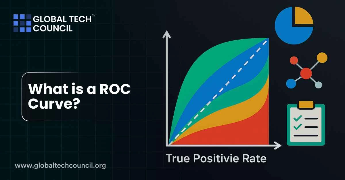
A ROC curve, short for Receiver Operating Characteristic curve, is a graph that shows how well your binary classification model performs across different decision thresholds. It plots the True Positive Rate (TPR) against the False Positive Rate (FPR) at every possible threshold. This curve helps you understand how your model balances between correctly identifying positives and accidentally flagging negatives as positives.
The ROC curve gives you a complete picture of your model’s performance, especially when working with imbalanced datasets or when accuracy isn’t a reliable metric.
Why Use a ROC Curve?
Accuracy alone doesn’t always tell the full story. If your dataset has 95% negatives and 5% positives, a model that predicts only negatives gets 95% accuracy but is completely useless.
ROC curves help solve this by visualizing performance across all thresholds. This is especially helpful in fields like healthcare, fraud detection, and spam filtering, where one type of error is more serious than the other.
What Goes on the ROC Curve?
To build a ROC curve, you need two key metrics at each threshold:
- True Positive Rate (TPR): Also known as recall or sensitivity. This shows how many actual positives the model catches.
- False Positive Rate (FPR): This shows how many negatives the model wrongly classifies as positive. It’s calculated as 1 – specificity.
As you change the threshold (from 0 to 1), these values change. The ROC curve tracks this movement.
What is AUC?
AUC stands for Area Under the Curve. It summarizes the entire ROC curve into a single number between 0 and 1.
- A perfect model scores 1.0.
- A model guessing randomly scores around 0.5.
- The closer to 1.0, the better your model is at separating classes.
AUC makes it easy to compare models. Higher AUC means better average performance across all thresholds.
ROC Curves Metrics
| Metric | What It Means | Why It Matters |
| True Positive Rate (TPR) | Ratio of correctly predicted positives | Shows sensitivity of the model |
| False Positive Rate (FPR) | Ratio of negatives wrongly marked positive | Indicates cost of false alarms |
| ROC Curve | TPR vs. FPR across all thresholds | Helps pick best decision threshold |
| AUC | Area under ROC curve | One-number summary of model performance |
How to Read a ROC Curve
Start from the bottom-left of the graph. As you increase the threshold, you move towards the top-right. A good model moves quickly to the top-left corner — meaning high TPR and low FPR.
If your ROC curve hugs the diagonal (from bottom-left to top-right), it means your model isn’t better than random guessing.
Advanced Variants of ROC Curves
Partial AUC
Sometimes, you care only about a small part of the ROC curve. For example, in fraud detection, you may care most when FPR is very low. Partial AUC focuses only on this important slice.
Time-Dependent ROC
Used in survival analysis, this version handles changing risks over time. It’s useful when outcomes aren’t immediate, like in healthcare.
Multi-Class ROC
For tasks with more than two classes, you can build ROC curves using a one-vs-all or one-vs-one approach. Another method is to calculate the volume under surface (VUS), a generalization of AUC.
These methods help you track which classes are being confused and where.
Scenarios to Use ROC Curves
| Scenario | Why ROC Helps | Tip |
| Medical diagnosis | Balances missed cases and false alarms | Choose threshold based on risk sensitivity |
| Fraud detection | Focuses on rare but important cases | Use partial AUC to focus on low FPR region |
| Model comparison | Simplifies comparison with a single score | Prefer higher AUC for better discrimination |
| Imbalanced datasets | Avoids misleading accuracy metrics | ROC shows true trade-off between TPR & FPR |
How It Works: A Simple Walkthrough
Imagine your model gives each input a score between 0 and 1. You set a threshold (say 0.5) and classify everything above it as positive.
Now, try this for every possible threshold from 0 to 1. For each one, compute TPR and FPR, and plot it. That’s your ROC curve.
The more your curve pushes towards the top-left, the better. It means you’re catching positives while making few false calls.
Common Mistakes to Avoid
- Don’t rely on ROC alone. A high AUC doesn’t always mean good precision.
- In highly skewed datasets, also check the Precision-Recall curve.
- Ignoring parts of the curve can hide important risks, especially if your domain is sensitive to false positives or negatives.
If you’re exploring how to interpret and explain these metrics in your work, the Deep tech certification gives you hands-on training on evaluation tools and techniques.
When to Use ROC in Real Projects
You should use ROC curves when:
- Your model outputs scores or probabilities
- You need to set or adjust decision thresholds
- The cost of false positives vs. false negatives is different
- Your dataset is imbalanced, and accuracy isn’t helpful
ROC is especially useful in applied fields like marketing, cybersecurity, clinical trials, and more.
For professionals looking to align AI results with business goals, the Marketing and Business Certification can help bridge that gap.
And if you want to go deeper into scoring, thresholds, and performance metrics, the Data Science Certification offers exactly that.
Conclusion
The ROC curve helps you see how your model performs across every threshold. It goes beyond accuracy and gives a full picture of trade-offs between detecting positives and avoiding false alarms.
AUC gives a single score, but the curve shows the full story. With modern variations like partial AUC and time-dependent ROC, it remains one of the most valuable tools in machine learning evaluation.
Use it wisely, and it can turn a good model into a great one.