

How Data Visualization Can Help Companies To Make Better Decisions
 Toshendra Sharma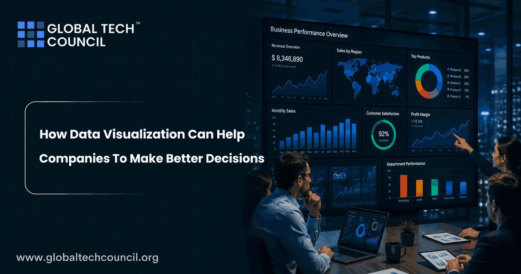
Companies today collect more data than any team could reasonably interpret by scrolling through spreadsheets, yet the businesses that actually win are the ones that turn that raw information into decisions fastest. Data visualization is the bridge between the two. By converting complex, high-volume datasets into charts, dashboards, and visual patterns the human eye can process instantly, visualization removes the friction between having data and actually acting on it. That shift has become measurably more important in 2026, with over 78 percent of businesses now using AI in at least one core business activity, much of it built directly into how data gets presented and interpreted. Building the technical foundation behind this kind of work is exactly what a Certified Data Science Developer credential is designed to provide, giving professionals the skills to turn raw data into genuinely decision-ready visuals.
Why Raw Data Alone Doesn't Drive Good Decisions
A spreadsheet full of numbers and a decision-ready insight are two very different things. Human beings process visual patterns far faster than rows of raw figures, which is exactly why a well-designed chart can reveal a trend in seconds that would take an analyst hours to spot buried in a table. This matters more as data volume grows, since the businesses generating the most data are often the ones least equipped to manually sort through it for what actually matters. Visualization solves this by surfacing patterns, outliers, and trends automatically, reducing the gap between when a problem or opportunity first appears in the data and when a decision-maker actually notices it. Understanding how to structure large, messy datasets so they can actually be visualized meaningfully in the first place is precisely the kind of skill a Certified Big Data Expert credential is built to develop, since even the most polished dashboard is only as useful as the data architecture feeding it.

How AI Is Changing Data Visualization in 2026
Artificial intelligence has moved from a premium add-on to the standard foundation underneath modern visualization platforms. AI is now embedded directly across data preparation, modeling, visualization, and insight generation in leading business intelligence tools, automatically analyzing datasets, suggesting the most appropriate chart types, and generating plain-language summaries of key findings without requiring a dedicated analyst for every request. Conversational analytics has become one of the clearest expressions of this shift, letting decision-makers ask a question in plain language and receive a relevant visual answer instantly, rather than navigating a complex dashboard built by someone else. This matters well beyond convenience, it genuinely expands who inside an organization can work with data directly, reducing dependence on a small analytics team as the sole gatekeeper to company insights.
From Static Charts to Prescriptive Dashboards
The most meaningful shift in 2026 is the move from dashboards that simply report what happened toward dashboards that actively recommend what to do next. Prescriptive dashboards, interfaces that suggest a specific action rather than just displaying a status, are increasingly replacing passive charts across enterprise environments, with an increasing share of routine operational decisions now being suggested or directly managed by AI agents working from the same underlying data. Real-time analytics has become essential alongside this shift, since businesses in 2026 can no longer afford to wait hours or days for a report when customer behavior, market conditions, and operational issues can change within minutes. Learning to build and evaluate this kind of intelligent, decision-oriented dashboard rather than a purely descriptive one is exactly where a solid Deep Tech Certification in data visualization and analytics infrastructure earns its value, since the underlying architecture needed for real-time, prescriptive dashboards is meaningfully more complex than a traditional static report.
The Real Risk: Visualization Without Governance
Not every AI-powered visualization initiative succeeds, and it's worth being direct about why. Augmented analytics implementations carry a documented failure rate as high as 68 percent when organizations adopt the technology without first establishing solid data governance, commonly because conflicting metric definitions across departments quietly destroy user trust in the dashboards meant to guide decisions. A well-publicized case involved a mid-sized SaaS company that spent 400,000 dollars implementing augmented analytics without a governance framework in place, only to see adoption collapse to just 12 percent within six months once employees stopped trusting the numbers they were seeing. The lesson is consistent across the industry: visualization technology only improves decision-making when the underlying data it displays is genuinely trustworthy, consistent, and clearly defined across the organization using it.
Technology & Problem Solving
Technology education is not only about learning tools or programming languages. It also involves understanding problems, analysing information, identifying patterns, and developing logical solutions. A Tech Olympiad gives students an opportunity to develop these problem-solving abilities while exploring different areas of technology.
Turning Dashboards Into Real Business Action
A visualization only earns its value the moment it changes an actual decision, a priority gets reordered, a budget shifts, a risk gets flagged before it becomes a real problem. Automated insights should not be praised simply because they surface something surprising, they matter when they genuinely lead to a change in behavior, resourcing, or strategy. As dashboards become more embedded directly into everyday workflows rather than living in a separate reporting tool nobody opens, organizations increasingly need people who can connect a well-built visualization to a clear, persuasive business case that actually gets acted on. That combination of technical visualization skill and clear communication is exactly where pairing data expertise with a Marketing Certification becomes genuinely valuable, helping professionals translate an accurate chart into a recommendation leadership will actually champion rather than quietly ignore.
Conclusion
Data visualization has become one of the most direct levers a company has for improving the speed and quality of its decisions, especially as AI increasingly automates the work of preparing, interpreting, and even recommending action from complex data. The technology itself keeps advancing, from conversational analytics to prescriptive, real-time dashboards, but the fundamentals haven't changed: a visualization only helps a company make better decisions when it is built on trustworthy, well-governed data and actually reaches the people empowered to act on it. Companies that get both of those pieces right are the ones turning their growing data volumes into a genuine competitive advantage rather than just a bigger pile of unread reports.
FAQs
1. What is data visualization in business?
Data visualization is the process of presenting data through charts, graphs, dashboards, maps, and other visual formats. In business, it helps employees and decision-makers understand complex information, identify patterns, compare performance, and make informed decisions more quickly.
2. How can data visualization help companies make better decisions?
Data visualization turns large and complicated datasets into easier-to-understand visual information. By highlighting trends, relationships, changes, and unusual results, it allows decision-makers to identify important information faster and use evidence rather than assumptions when evaluating business opportunities.
3. Why is data visualization important for business decision-making?
Businesses generate large amounts of data from sales, customers, marketing, finance, operations, and other activities. Visualization makes this information easier to interpret, helping managers understand what is happening, identify potential problems, measure performance, and determine where action may be needed.
4. What are the main benefits of data visualization for companies?
Key benefits include faster data interpretation, improved communication, easier identification of trends, better performance monitoring, more effective reporting, and stronger data-driven decision-making. Visual dashboards can also help different departments work from a shared understanding of business performance.
5. How does data visualization improve business analytics?
Visualization provides a visual layer for analytical results, making patterns and relationships easier to recognize. Instead of reviewing large spreadsheets or raw datasets, analysts and managers can use charts and dashboards to explore important metrics and investigate areas that require further analysis.
6. How can data visualization help identify business trends?
Charts and graphs can show how metrics change over time, making increases, decreases, seasonal patterns, and unusual fluctuations easier to recognize. Companies can use these insights to evaluate performance and make more informed decisions about future strategies.
7. How does data visualization help companies understand customers?
Businesses can visualize customer demographics, purchasing behavior, engagement, retention, feedback, and other metrics. These insights can help organizations identify customer segments, understand changing preferences, and develop products, services, or marketing strategies that better address customer needs.
8. Can data visualization improve marketing decisions?
Yes. Marketing teams can use dashboards to analyze metrics such as website traffic, conversions, campaign performance, customer acquisition, and engagement. Comparing these metrics can help marketers determine which strategies are performing well and where budgets or resources may need adjustment.
9. How does data visualization help with financial decision-making?
Financial dashboards can present revenue, expenses, profitability, cash flow, budgets, and financial trends in an accessible format. Decision-makers can use these visual insights to monitor financial health, identify potential issues, and evaluate business performance.
10. How can data visualization improve sales performance?
Sales teams can visualize revenue, sales targets, conversion rates, pipeline stages, customer acquisition, and regional performance. This makes it easier to identify high-performing areas, detect gaps, track progress toward goals, and prioritize sales opportunities.
11. How does data visualization support operational decisions?
Organizations can use visualization to monitor production, inventory, supply chains, employee productivity, delivery times, and other operational metrics. Real-time or regularly updated dashboards can help managers identify bottlenecks and make faster operational decisions.
12. What types of data visualization are commonly used by businesses?
Common formats include bar charts, line charts, pie charts, scatter plots, heat maps, geographic maps, KPI dashboards, and tables with visual indicators. The appropriate format depends on the type of data and the question the business needs to answer.
13. What is a business intelligence dashboard?
A business intelligence dashboard is a visual interface that brings together important business metrics and data from different sources. It allows users to monitor key performance indicators, explore trends, and gain insights without having to examine multiple separate reports.
14. How does data visualization help detect problems?
Visualizations can make unusual changes, gaps, outliers, and declining performance easier to spot. For example, a sudden drop in sales or an unexpected increase in operating costs may become immediately visible on a well-designed dashboard, prompting further investigation.
15. Can data visualization improve collaboration within a company?
Yes. Shared dashboards and standardized visual reports can give teams a common view of important business metrics. This can improve communication between departments and make discussions more focused because teams can refer to the same underlying information.
16. What are the challenges of using data visualization?
Challenges include poor-quality data, misleading chart choices, excessive visual complexity, outdated information, inconsistent metrics, and lack of data literacy. A visually attractive dashboard can still lead to poor decisions if the underlying data or analysis is incorrect.
17. How can companies create effective data visualizations?
Companies should begin with the decision or question they want the visualization to support. They should then use reliable data, select an appropriate chart type, keep the design clear, highlight important metrics, avoid unnecessary visual elements, and provide enough context for users to interpret the information correctly.
18. What tools are used for business data visualization?
Businesses commonly use tools such as Microsoft Power BI, Tableau, Looker, Excel, Qlik, and programming libraries for more customized analysis. The best tool depends on factors such as data sources, organizational requirements, technical expertise, scalability, and reporting needs.
19. How does real-time data visualization help businesses?
Real-time dashboards can provide frequently updated information about operations, sales, customer activity, inventory, or other important metrics. When timely decisions are required, having current information can help businesses respond more quickly to changing conditions.
20. What is the future of data visualization in business?
The future of business data visualization is likely to involve greater use of AI-assisted analytics, automated insights, interactive dashboards, natural-language querying, real-time data, and predictive analytics. These developments can make complex business information more accessible while helping decision-makers focus on the insights that matter most.
Related Articles
View All
Big Data
Large Scale Data Visualization
What is Large Scale Data Visualization Organizations today generate enormous volumes of data from digital platforms, sensors, financial systems, and online interactions. Interpreting such massive datasets using raw numbers alone is nearly impossible. Large scale data visualization solves this…

Big Data
How Does Big Data Technology Help in Preventing Money Laundering?
With the implication of digitization, everything we do has changed. And this advancement has been especially influencing the sector of online payments and transactions. Today from ordinary individuals to big businesses, all rely on online transactions as they are quick and convenient. But along…

Big Data
How HR Using Data Analytics For Better Productivity
Analytics in HR is rapidly evolving as a phenomenon in the corporate world due to its in-depth processes that provide a structure for formulating solutions to various issues. According to a report by data science experts, company leaders rely on analytics to gain more actionable information and…
Trending Articles
The Role of Blockchain in Ethical AI Development
How blockchain technology is being used to promote transparency and accountability in artificial intelligence systems.
AWS Career Roadmap
A step-by-step guide to building a successful career in Amazon Web Services cloud computing.
Top 5 DeFi Platforms
Explore the leading decentralized finance platforms and what makes each one unique in the evolving DeFi landscape.